The Ultimate NZ Guide for Lead Generation Web Design (2025)
Discover what’s stopping your NZ website from generating leads and how to fix it with lead generation web design that’s built to perform.


Most websites in New Zealand look fine – clean, modern, even professional. But here’s the truth: looking good doesn’t mean performing well. If your website isn’t actively generating enquiries, bookings, or sales, it’s not doing its job. It might be costing you more in missed opportunities than you realise.
In 2025, effective web design isn’t just about aesthetics. It’s about function, flow, psychology, online presence, and speed. A website that gets leads is built with user friendliness, intent, trust, and action in mind – from the moment someone lands on the page to the moment they convert.
In this guide, you’ll learn how to build a lead generating web design strategy that actually delivers results. Whether you’re a tradie, consultant, agency, or local service provider – the principles are the same.
We’ll cover:
- What separates high-converting websites from the rest
- How to use design, copy, structure, and flow to increase action
- The strategy behind every page, call-to-action, and conversion
- Common mistakes that kill your results – and how to fix them
Ready to build a website that actually works? Let’s get into it.
Understanding Your Target Audience
Before you design a single pixel, you need to know who you’re designing for.
One of the biggest reasons websites fail to generate leads is this: they’re built around what the business wants to say, not what the visitor needs to hear.
Lead-generating websites are designed for humans – real people, with real goals, fears, questions, and objections. Your job is to meet those people where they are, and make it stupidly easy for them to take the next step.
Every Lead Gen Website Design Strategy Should Start With Questions:
- Who is my ideal customer?
- What do they want from my website & business (information, pricing, trust, help)?
- What are they frustrated with in my industry?
- What are they nervous about before contacting me?
- What would make them take action – right now? Think their of their goals and desired outcomes.
The 3 Types of Visitors (and What They Need)
The Ready-to-Buy: They know what they want. They just need a reason to trust you. Prioritise: Clear CTAs, testimonials, pricing or booking options.
The Researcher: They’re weighing up options. You need to educate, not just sell. Prioritise: Case studies, FAQs, value proposition clarity, comparisons.
The “I Just Clicked” Visitor: No intent yet – they’re browsing or got referred. You need to keep them around. Prioritise: Clear value message, easy navigation, compelling first impression.
Build for Their Journey, Not Yours
Visitors don’t follow a perfect funnel. They jump around. They skim. They scroll back. That’s why good website design creates multiple entry points to the same outcome.
- Every products or service page should include a CTA
- The homepage should show immediate value + next steps
- Your nav should be intuitive – not clever
Designing for your audience means understanding their priorities better than they do – and giving them the confidence to take action.

Crafting Clear Value Propositions
If your website doesn’t communicate who you help, what you do, and why it matters within 5 seconds – you’re losing leads.
Your value proposition is the foundation of your messaging. It’s the one line or section that tells your visitor: “You’re in the right place – and we can solve your problem.”
What Most Websites Get Wrong
Before we look at what works, let’s call out some of the most common mistakes NZ businesses make when trying to explain their value online:
- They talk about themselves, not the customer
- They list features instead of outcomes
- They bury the main point halfway down the page
- They try to be clever instead of clear
These may seem small – but they create friction and confusion that kill conversions.
What a Strong Value Proposition Looks Like
Here’s a simple value proposition framework that consistently works across industries:
We help [audience] get [outcome] without [pain point].
This keeps your messaging clear, relevant, and outcome-focused. Below are two examples tailored for NZ businesses:
Example (for a local plumbing company): “Fast, affordable plumbing for Auckland homes – no call-out fees and 24/7 emergency service.”
Example (for a consultant): “Get strategic clarity in your business in under 30 days – without the fluff or corporate jargon.”
Where to Place Your Value Proposition
You could write the best value prop in the world – but if it’s hidden below the fold or buried in a paragraph, it’s useless. Here’s where it should go to drive maximum impact:
- At the very top of your homepage (above the fold)
- On key service pages – tailored to each service
- In your meta descriptions (for SEO click-through)
- In your social previews, ad copy, and landing pages
- In bulletpoints for skim readers
Repetition is okay – in fact, it’s necessary. Users need to hear the core value multiple times before acting.
Checklist for a Lead-Ready Value Proposition
Use this checklist to test whether your value prop will drive real results – or just sit there looking nice:
- Is it benefit-driven (not just “what we do”)?
- Is it specific (can I picture the result)?
- Is it relevant (do I feel like this is for me)?
- Is it visible within 3–5 seconds on page load?
Even one “no” is a signal it needs work.
Your value proposition isn’t just a tagline – it’s the hook. Get it right, and the rest of your website does its job better.
User Interface (UI) Design Essentials
A great UI doesn’t just look good – it makes your website feel intuitive, trustworthy, and easy to use. It’s the bridge between what your user wants to do and what your site is telling them to do.
In a world where users bounce in under 10 seconds, your interface design is either frictionless and effective – or it’s a conversion killer. Clarity in UI is non-negotiable in lead generation in website design. Here’s how to get it right.
Colour Theory and Emotion
Colour choices influence how your users feel – often before they’ve read a single word. The right colour palette builds trust and guides behaviour. The wrong one makes people uncomfortable and unsure.
What to do: Choose your palette based on your brand personality and the emotional response you want from users.
| Colour | Emotion / Effect |
| Blue | Trust, Calm, Professionalism (Great for service based businesses and finance) |
| Red | Action, Urgency (Great for CTA’s, not backgrounds) |
| Green | Success, Growth, Safety (Ideal for eco or health brands) |
| Black / Grey | Luxury, Sophistication, Simplicity |
| Orange / Yellow | Creativity, Warmth, Energy (Use sparingly to avoid overwhelming your users) |
Pro tip: Stick to 2–3 primary colours and use 1 strong contrast colour for calls-to-action (CTAs).
Fonts and Readability
Your content can only convert if it’s actually read. Poor font choices lead to confusion, frustration, or instant bounces – especially on mobile.
What to do: Choose fonts for clarity, not creativity. Clean, modern, web-safe fonts like Inter, Lato, or Roboto work best and keep them within your brand identity.
Best practices:
- Limit to 1–2 fonts across your whole site
- Ensure body font size is at least 16px for readability
- Use heading styles to create structure and momentum
- Avoid low-contrast combinations like light grey on white
- Make sure they’re actually readable.
Readable = trustworthy. If people can skim easily, they’re more likely to stay and act.
Visual Hierarchy and Spacing
People don’t read websites – they scan them. Without visual hierarchy, users feel lost or overwhelmed. And confused users don’t convert..
What to do: Design to guide attention. Use spacing, sising, and contrast to lead users from section to section, CTA to CTA.
Use these tactics:
- Use large, bold headlines to direct focus
- Break up text with icons, bullets, and images
- Group related content with whitespace
- Use contrasting buttons or colours for actions
If everything looks important, nothing feels important. Hierarchy creates clarity.
Accessibility Basics
Inclusive design helps more users interact with your site – and it’s good for SEO. Many accessibility best practices also improve performance and clarity.
What to do:
- Add alt text to all images (good for SEO and screen readers)
- Make forms and menus keyboard-navigable
- Don’t rely on colour alone to convey information
- Check contrast with tools like WebAIM Contrast Checker
More users can engage, Google rewards accessibility, and you reduce friction for all visitors – not just those with impairments.
UI design isn’t just about looking polished – it’s about making users feel confident, supported, and in control. When you design for clarity and comfort, your users are far more likely to take action.

Designing with Conventions in Mind
Design conventions aren’t just habits – they’re learned behaviours.
Over time, users have come to expect certain layouts, placements, and navigation styles on websites. When you match those expectations, users feel confident and in control. When you break them without purpose, they hesitate – and hesitation kills conversions.
But used wisely, breaking convention can help you stand out. The trick is knowing what to keep familiar, and where to inject creativity without sacrificing usability.
Why Design Conventions Matter
People scan websites, they don’t just read them. They want instant orientation – and they rely on conventions to help them move quickly and comfortably.
When conventions are followed:
- Visitors find what they’re looking for faster
- There’s less friction in decision-making
- You gain instant credibility simply by being “easy to use”
Familiar = trustworthy. If users have to pause to figure out how your site works, you’ve could have already lost them.
When It Pays to Break the Rules
Sometimes, stepping outside the box is exactly what’s needed to grab attention – especially in saturated markets or creative industries.
When to break the rules intentionally:
- You want to emphasise innovation or uniqueness
- You have clear data showing a standard element isn’t working
- You’re improving usability, not just trying to look “different”
Creativity should serve clarity – not compete with it.
Side-by-Side: Conventions vs Creative Flips
This table breaks down common website norms and offers alternatives that can still feel intuitive – if done strategically.
Design ConventionWhen to Break It (Strategically)CTA top right or mid-scrollFull-screen CTA with video, or inline forms on service pagesStandard nav menuSticky “book now” or “get quote” bar insteadWhite backgroundDark mode styling for tech brands or creativesServices in dropdownsScrollable horizontal cards for mobile UXStatic testimonialsVideo proof or embedded Google review feeds
| Design Convention | When to Break It (Strategically) |
| CTA Top right or mid-scroll | Full-screen CTA with video, or inline forms on service pages |
| Standard Nav menu | Sticky “Book Now” or “Get Quote” bar instead |
| White background | Dark mode styling for branding |
| Services in dropdowns | Scrollable horizontal cards for mobile UX |
| Static testimonials | Video proof or embedded Google review feeds |
Test creatively, but always prioritise clarity and conversion flow.
Don’t Break These (Unless You Really Know What You’re Doing)
There are some conventions so deeply ingrained in user behaviour that breaking them almost always creates friction.
Keep these intact unless you have exceptional user testing data:
- Logo placement (top left = trusted navigation anchor)
- Vertical scroll (users expect to scroll down, not sideways)
- CTA language (buttons like “submit” don’t drive action – but neither does “click here”)
- Menu logic (services, contact, and about should be easy to find in 1–2 clicks)
Confusing users – even for a second – is a conversion you’ll never get back. Conventions aren’t limitations. They’re foundations. Use them to build trust, and only break them when you’re adding clarity or engagement in return.
And theres also conventions for website lead generation – Which you’re learning right now!
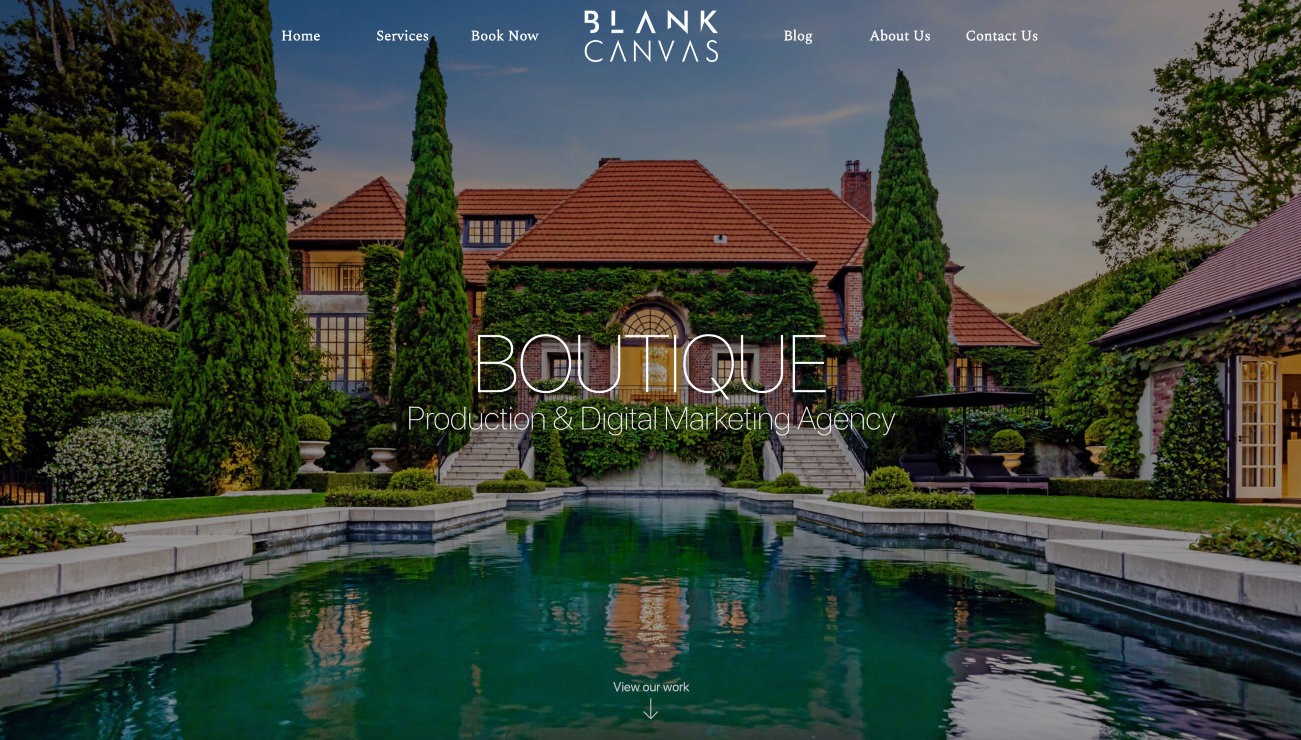
Above the Fold: What Users See First
The first few seconds on your website determine everything. If your “above the fold” content doesn’t give users a reason to scroll, click, or trust you – they’re gone.
Above the fold refers to the portion of your website that’s visible before any scrolling happens. It’s your digital first impression, and it’s arguably the most valuable real estate in lead gen website design. Let’s break down exactly how to make it perform.
Why It Matters
Visitors don’t wait around. They decide whether to stay or leave almost instantly – often within 5 seconds.
Your job? Make sure what they see first clearly answers:
- Who you are
- What you offer
- What they should do next
If the message is unclear or buried under clutter, you’ll lose attention before you even get started.
What to Include Above the Fold
This space isn’t for decoration – it’s for conversion. You don’t need to say everything – just enough to keep them scrolling or clicking.
Include these must-haves:
- Clear value proposition (focused on outcomes, not services)
- Primary CTA (simple, benefit-led, and visible)
- One strong visual (reinforces the message – no sliders or carousels)
- Visible logo + nav (users should know where they are and how to navigate)
Optional trust boosters:
- Logo carousel or “As seen in”
- Review snippet or short client quote
Keep in mind: This section is about clarity, not complexity.
Desktop vs Mobile Fold (They’re Not the Same)
What looks great on desktop might break or confuse on mobile. And since over 50% of NZ traffic is mobile – that’s a problem.
Mobile fold priorities:
- Stack content vertically for clarity
- Keep CTA buttons thumb-friendly and visible without scrolling
- Cut animations or large media that delay load time
- Prioritise speed and simplicity
Bonus tip: Use Hotjar scroll maps to see how far mobile users actually go.
Test It: The 5-Second Rule
You’re too close to your own website to judge its clarity – which is why you need fresh eyes.
Run this simple test:
- Open your homepage
- Let someone view it for 5 seconds – perhaps a close customer or external person
- Ask them: What does this business do? Who is it for? What would you do next?
If they hesitate – you’ve got clarity issues above the fold. Above the fold is where visitors decide whether to stay or leave.
If you nail your message, CTA, and layout here, everything else becomes easier – from trust to scrolling to conversion.
Copywriting That Converts
Design draws them in – but it’s your copy that gets the click. If your words don’t communicate clearly, confidently, and persuasively, it doesn’t matter how beautiful your site is.
Good copy is what turns interest into action. Whether you’re writing a homepage, service page, or landing page, your copy should guide users toward trust and decision – not just “fill the space.”
Why Copywriting Matters in Web Design
Design without messaging is like a car with no engine – it might look great, but it won’t take anyone anywhere.
Effective web copy does 3 things:
- Clarifies value – what’s in it for the visitor
- Builds trust – why they should choose you
- Guides action – exactly what they should do next
Well-written copy connects emotionally, positions your offer clearly, and removes friction from the decision-making process.
1. Structure Before Style: The Copy Hierarchy
Without structure, users get lost. Your copy needs to guide them from “What is this?” to “I want this.”
Recommended structure:
- Headline – Bold and benefits-led
- Sub-headline – Clarifies or supports the promise
- Intro paragraph – Reinforces value or urgency
- Bullet points – Skimmable, benefit-driven highlights
- CTA – One clear next step (with action language)
Example (for a tradie homepage):
- Headline: “Reliable Plumbing in Wellington – Fast, No-Fuss, Fixed First Time”
- Subheadline: “Available 24/7, no call-out fees, trusted by 1,000+ locals.”
- CTA: “Book Your Free Quote Now”
This structure supports skimmers, scanners, and decision-makers all at once.
2. Use Clear, Conversational Language
You’re not writing for your competitors – you’re writing for your customers. If your copy is stiff, vague, or too technical, they’ll bounce.
Tips to apply:
- Use “you” and “your” more than “we”
- Avoid jargon or internal language – talk like your best sales rep would
- Keep sentences short (under 20 words) and remove fluff
- Emphasise outcomes, not processes
Before: “We provide integrated digital solutions for end-to-end business challenges.”
After: “We help NZ businesses turn their websites into lead machines – without the stress or guesswork.”
Clear, direct copy earns trust faster – especially on mobile.
3. Headlines and CTAs That Drive Action
Your headline is the hook. Your CTA is the close. Both need to be intentional, benefit-focused, and tested over time.
Headline templates that convert:
- “Get [benefit] without [frustration]”
- “How [audience] are solving [problem] in [timeframe]”
- “X Reasons [Audience] Trust Us for [Result] in [Location]”
Effective CTA tips:
- Use verbs that trigger outcomes: “Get Started”, “Claim My Free Audit”, “Book Now”
- Be specific and confident – no “submit” buttons
- Place CTAs above the fold, mid-scroll, and at the end of each page
You’re not asking users to think – you’re guiding them to act.
Bonus: Microcopy That Builds Trust
It’s not just your big headlines that influence action – it’s the tiny moments between them.
Microcopy includes:
- Button subtext
- Form field instructions
- Confirmation messages
- Warnings and labels
Examples that increase conversions:
- “We’ll respond within 24 hours – guaranteed.”
- “No payment required today.”
- “You’re in control – unsubscribe anytime.”
Trust is built in the margins. The more confident your users feel, the more likely they are to take the next step. The words on your website either build momentum or stall the journey.
Strong headlines and outcome-driven CTA’s are pillars of effective lead generation in website design. If they’re not clear, human, and focused on your user’s outcomes – they’re getting in the way.
Designing for Conversion (UX + CRO in Practice)
A beautiful website that doesn’t convert is just a brochure. If your design isn’t built to guide behaviour and drive action, it’s not doing its job – no matter how “nice” it looks.
This section bridges the gap between user experience (UX) and conversion rate optimisation (CRO). Because great design isn’t about being creative – it’s about being effective.
Why UX and CRO Matter in Website Design
UX ensures visitors feel comfortable and confident. CRO ensures they take the next step. When used together, they make your website feel seamless and persuasive – without being pushy.
Think of UX as the path… and CRO as the signs along the way.
Map One Clear Goal Per Page
When users are given too many options, they choose none. Every page should have a single, specific purpose – and every design element should support that.
How to apply this:
- Homepage → Get them to explore or take action
- Service page → Get them to book a quote
- Blog post → Get them to read more or download something
- Contact page → Get them to submit an enquiry
One goal per page = less confusion, more conversions.
Design for Scanners (Not Readers)
Most visitors won’t read everything – they’ll skim. Your design must make it easy for them to understand your offer in under 30 seconds.
What to do:
- Break content into sections with bold headers
- Use bullet points and short paragraphs
- Highlight CTAs at logical intervals (e.g. after a key benefit or testimonial)
- Make “next steps” visually obvious
Pro tip: Use scroll heatmaps (e.g. Hotjar) to see where people stop reading – and rework weak areas.
Place CTAs Where Action Happens
Your call-to-action buttons need to show up where and when your users are most likely to act – not just at the bottom of the page.
Best practice CTA placements:
- Above the fold (top of page)
- After key benefit explanations
- Mid-scroll, especially on long pages
- Beside testimonials or trust signals
- At the end of the page
CTA design tips:
- Make it look like a button (don’t just underline text)
- Use contrast colour and clear spacing
- Add microcopy for reassurance: “Takes 30 seconds. No credit card needed.”
Remove Friction, Build Confidence
Users bounce when they feel unsure. Smart design reduces friction – and smart copy builds trust.
Ways to reduce friction:
- Don’t use long, complex forms – keep it to 3–5 fields
- Show a “what happens next” message after form submissions
- Add testimonials or trust icons near every major decision point
- Ensure buttons and links work exactly as expected (no surprise redirects)
Test & Learn: CRO Is Never Finished
What works today might not work tomorrow. The best-performing websites are updated, optimised, and tested regularly.
Simple ways to test CRO changes:
- Run A/B tests for different headlines or CTAs
- Test short vs long forms
- Use Hotjar to identify scroll or drop-off issues
- Track your form completion rate over time in GA4
If you’re not testing, you’re guessing – and guessing leads to lost leads.
Bottom line:
Designing for conversion is about purpose, not polish. If every page has one goal, one CTA, and one clear path forward – you’re already ahead of most NZ websites.
Internal Linking & Page Journey Strategy
Most websites focus on what each page says. But smart websites focus on where each page sends people next.
Internal linking – how your pages connect to each other – is one of the most overlooked strategies in NZ business websites. Done well, it keeps users engaged, guides them toward your services, and boosts your Google rankings in the background.
Why Internal Linking Matters
People don’t navigate your website in a straight line. They might land on a blog, skim a testimonial, then bounce – unless you give them a reason and a route to keep going.
Internal links act like signposts:
- They guide visitors toward pages that answer their next question
- They increase time on site (a good signal to Google)
- They turn passive traffic into active leads
If users hit a dead end, they leave. If they hit a new opportunity, they click.
Design Your Page Journey Flow
A good website feels like a story unfolding. A bad one feels like a bunch of disconnected pages.
A strong internal journey:
- Meets visitors at their entry point
- Gives them confidence through proof and content
- Sends them to take action with as few steps as possible
Simple page flow for service businesses:
- Homepage → Key services → Social proof → CTA
- Blog → Link to service page, relevant case study, enquiry form
- Service page → Value prop → Proof → CTA → FAQ or form
Every page should gently nudge people forward. Don’t assume they’ll figure it out.
Smart Internal Link Placement (Design-Backed)
Where and how you place links affects whether users notice them – and whether they click.
High-performing placements:
- Within body copy (naturally linked to helpful content)
- Mid-scroll CTAs: “Need help with this? [Check our services]”
- In your testimonials: “Read [Client Name]’s full case study”
- Footer menus and sticky nav (useful for repeated decisions)
Design advice:
- Use visual hierarchy: buttons, bold links, icons
- Avoid clutter: 1–2 links per content block max
- Make sure linked pages actually add value – don’t link just to link
SEO Benefits of Internal Linking
Internal linking isn’t just for humans – it’s also how Google crawls and ranks your content.
When you build strong internal links:
- Pages get indexed faster
- Link equity (ranking power) flows to the pages that need it
- Google understands your topical authority (great for SEO clusters)
Quick SEO wins:
- Every blog should link to at least one service page
- Use descriptive anchor text (“web design in NZ”) – not just “click here”
- Interlink FAQs, related blog posts, and testimonials for added context
The bottom line:
Internal linking might seem small, but it has a big impact. It improves user flow, supports SEO, and helps convert browsers into buyers. Think of it as the glue that holds your whole site together – and turns it into a lead engine.
SEO-Optimised Design

If your website isn’t being found, it doesn’t matter how well it’s designed. SEO-optimised design ensures your site not only looks great – but ranks in Google, loads fast, and drives organic traffic that converts.
In New Zealand, where many businesses rely on local search, SEO-friendly design is a core part of lead generation. This isn’t about stuffing keywords – it’s about structuring your site so search engines (and users) love it.
And no lead generation web design strategy is complete without SEO at every level!
Why SEO Needs to Be Baked Into Design (Not Added Later)
Many websites are built without SEO in mind – and then try to patch it in after. That’s backwards.
If your content, structure, and speed aren’t optimised from day one, Google will struggle to index or rank your site – and you’ll miss out on free traffic.
An SEO-optimised website helps you:
- Get discovered on Google
- Increase traffic from buyers actively searching for your services
- Reduce your dependency on ads
SEO isn’t a “nice to have” – it’s a lead source. If your competitors are ranking and you’re not, they’re winning the clicks.
Technical SEO Built Into the Foundation
Technical SEO tells Google how fast, secure, and crawlable your site is – even before it looks at your content. These behind-the-scenes decisions directly affect your visibility, speed, and ranking potential.
What to prioritise:
- Clean, lightweight code (avoid bloated themes and builders)
- Fast load times across devices
- Mobile responsiveness baked into the grid
- Secure connections (HTTPS/SSL)
- Schema markup for enhanced listings (e.g. FAQs, reviews)
- Flat and crawlable site structure (easy to navigate, easy to index)
Structure Pages for Ranking and Relevance
Google wants to serve users the best answer – fast. And your page structure helps users understand your content, topic depth, and intent.
What this looks like in design:
- Clear heading hierarchy (H1 > H2 > H3)
- Keywords placed in headings, intro paragraphs, and image names
- Page layouts that reflect logical, skimmable flows
- Consistent URL patterns that reflect topic relevance
This makes your content easier to read and rank – for both humans and bots.
Link Strategy for SEO and User Flow
Google follows links to understand your content relationships. So do users.
Good SEO linking balances:
- Internal links to pass authority and guide navigation
- External links to reputable sources (builds trust and relevance)
Examples:
- A blog post about “website load speed” should link to your service page on performance optimisation
- A testimonial page could link to your “case studies” page
- A location page should link to relevant local directories or review platforms
Meta, Schema & Indexing Basics
Search engines rely on metadata to understand your pages, display them properly in search results, and determine how relevant they are.
Minimum checklist:
- Custom meta titles and descriptions for every page
- Alt text on images (great for SEO + accessibility)
- Open Graph tags for social sharing previews
- Schema markup to enhance search features (stars, FAQs, pricing, etc.)
- Submit XML sitemap and robots.txt in Google Search Console
This is how your site communicates with Google – and ranks higher because of it.
A fast, SEO-structured website drives results long after launch. It brings in qualified traffic, builds authority, and makes sure your message actually gets seen.
Mobile-First & Responsive Design

In New Zealand, more than 50% of website traffic happens on mobile. If your site doesn’t perform flawlessly on a phone, it’s losing leads – fast.
Mobile-first design isn’t about shrinking your desktop layout. It’s about designing from the mobile experience up – making sure speed, usability, readability, and conversion flow work on the smallest screen first. Let’s walk through what that actually means (and why it matters more than ever in 2025).
Why Mobile-First Design Isn’t Optional
Google now uses mobile-first indexing – meaning it looks at your mobile site first when deciding how to rank you. But more importantly, users expect mobile to work just as well (if not better) than desktop.
If buttons are hard to tap, text is too small, or images take too long to load, they won’t wait – they’ll leave.
Mobile-First vs Responsive Design
Let’s clarify the difference:
- Responsive design = adjusts content to fit any screen
- Mobile-first design = starts from the mobile user’s experience, and expands upward to desktop
Why mobile-first wins:
- It prioritises load time and readability
- Forces clarity and concise content
- Simplifies navigation (less clutter = more focus)
- Encourages better visual hierarchy and CTA placement
Essentials for Mobile-First Performance
1. Clear, readable content:
Text must be large enough to read without zooming. Use short paragraphs, large line heights, and vertical content blocks.
2. Fast-loading media:
Optimise images for mobile (WebP format, scaled sizes). Avoid autoplay video or huge hero images unless they’re compressed well.
3. Thumb-friendly design:
Buttons should be at least 44px tall and spaced to avoid mis-taps. CTAs should sit in the natural thumb zone, especially on scroll.
4. Fixed headers and sticky CTAs:
Keep navigation accessible, and consider persistent “Book Now” buttons for mobile users – especially on service or contact pages.
5. Mobile-optimised forms:
Use simple form fields (auto-fill, numeric keypads, minimal inputs). Avoid “full-page” forms that overwhelm the screen.
Test Like a User, Not a Developer
Quick tips:
- Open your site on your own phone (not just the dev tool emulator)
- Try navigating one-handed – can you get to the main CTA in 5 seconds?
- Use Google’s Mobile-Friendly Test to see how your site scores
- Use Hotjar on mobile traffic to spot drop-offs, scroll patterns, and rage taps
Mobile-first design isn’t a trend – it’s the new baseline. If your mobile site is slow, clunky, or hard to use, your visitors (and Google) will move on.
Trust Signals & Social Proof
No matter how sharp your design or compelling your copy – if users don’t trust you, they won’t act. Trust is the difference between a bounce and a booking. And most of it happens before the user even thinks about filling out your form.
In a digital-first NZ economy, your website is your handshake – and trust signals make it feel solid, offer social proof, and are one of the biggest lead gen web design strategies out there.
Why Trust Is a Conversion Multiplier
NZ customers are naturally sceptical. Whether it’s booking a tradie, hiring a coach, or buying a high-ticket product – they want proof.
Trust isn’t just about reputation. It’s about safety, confidence, and relatability. No one buys from a website they don’t trust – even if the offer is perfect.
Key Trust Signals to Include (and Where to Place Them)
Trust signals work best when placed near decision points. Don’t bury them in a footer or a separate “Reviews” page – integrate them into the experience.
1. Testimonials
- Use short, relevant quotes tied to outcomes: “We grew by 38% in 6 months”
- Include the customer’s full name, photo, and business (if possible)
- Place them near CTAs and forms to reduce hesitation
2. Google Reviews / Star Ratings
- Use a plugin or embed to show real-time reviews
- Display stars near CTAs: “Rated 4.9 from 120+ NZ clients”
3. Case Studies & Results
- Showcase project stats or outcomes in 1–2 paragraphs
- Bonus: link to full case studies (internal linking opportunity)
4. Trust Badges
- Include affiliations (NZ Master Builders, NZTE Registered), awards, and certifications
- Place them near service descriptions or checkout forms
5. Media Features / “As Seen In”
- If you’ve been featured in publications or partner brands, add logos in a horizontal carousel
- Ideal for homepage hero or below the fold
Best Placement for Social Proof
Trust signals should follow the user’s decision path:
| Page Area | Trust Element |
| Home Page Fold | Google ratings, testimonial or client count |
| Mid-scroll on services | Testimonials and mini-case studies |
| Beside CTA’s | A single strong quote or rating |
| Footer or nav | “Why Choose Us”, “Case Studies”, “Reviews” links |
| Forms & Checkout | Trust badge + reassurance copy (“No Spam”) |
Bonus: Reuse proof across formats – add reviews to landing pages, ad copy, and social media.
Trust-Building Microcopy Examples
Trust isn’t only visual – it’s verbal too. These small copy cues can ease concern and increase conversions:
- “We reply within 24 hours – no pushy sales tactics.”
- “Trusted by 300+ NZ businesses.”
- “Real results, real clients – no fluff.”
- “See our client results →” (link to proof)
Tech Choices That Impact Design Performance
Design isn’t just about how your site looks – it’s about what’s powering it underneath.
The tech you choose for your website directly affects its speed, flexibility, SEO, security, and how easy it is to scale over time. And in NZ, where many businesses still run on outdated builders or bloated WordPress themes, that tech debt is costing leads.
This section shows you how to make smart technology decisions that support long-term performance.
Why Tech Decisions Shape Performance
You could have perfect messaging and a beautiful layout – but if your CMS is slow or restrictive, your whole site underperforms.
Tech impacts:
- Load speed (affects bounce rate and SEO)
- Mobile experience (affects conversions)
- Scalability (affects how easy it is to grow)
- Security and maintenance (affects trust and uptime)
- Flexibility for marketing teams (affects how often you can update content)
CMS & Builder Comparison (Pros and Pitfalls)
PlatformProsPitfallsWordPressFlexible, familiar, strong plugin ecosystemCan get bloated fast with themes/builders; security risks if unmanagedWebflowGreat for design freedom, visual editing, cleaner codeLearning curve; CMS limitations for large content sitesWix/SquarespaceEasy setup, good for small budgetsLimited performance, slow load times, SEO constraintsNext.js + Headless CMS (e.g. Sanity, Prismic)Fastest load speeds, fully custom, scalableRequires dev support; not DIY-friendly but ideal for agencies or growth brands
| Platform | Pros | Cons |
| WordPress | Flexible, familiar and highly used, strong plugin ecosystem | Can get bloated really fast with themes and builders, security risks if unmanaged |
| Webflow | Great for design freedom, visual editing, cleaner code | Learning Curve, CMS limitations for large content sites |
| Wix and Squarespace | Easy setup, good for small budgets | Limited performance, slow load times, SEO constraints |
| Next.js + Headless CMS (Sanity for example) | Fastest load speeds, fully custom, scalable | Requires dev support, not DIY-friendly (In terms of editing design) |
Our take? If you’re serious about long-term SEO, speed, and conversion – low-code tools won’t cut it forever. Invest in a performance-first stack.
Key Tech Elements That Impact Speed
These often-overlooked choices have big consequences:
- Theme or template quality – Pre-built themes often load excessive scripts
- Plugins/add-ons – Too many = longer load and maintenance issues
- Hosting – Cheap hosting = slow site, poor uptime, SEO loss
- Code bloat – Every feature or animation adds weight – streamline or remove what’s not necessary
What to do instead:
- Use custom or lightweight templates
- Keep plugins to essential, security-vetted tools only
- Choose fast, local hosting (like Cloudflare, Kinsta, or NZ-specific providers)
- Minify and compress all scripts, styles, and images
What to Ask Your Developer or Web Agency
Not every developer builds for performance. Here are the red flags and the questions that help avoid future issues:
Ask:
- “Will my site score 90+ on Google PageSpeed after launch?”
- “What happens if I want to add landing pages myself?”
- “Is this site easy to maintain without a dev?”
- “How will this site scale as we grow?”
If they can’t answer those clearly, you’re not getting a performance-first website and great design needs great infrastructure.
Bottom line:
If your tech is slow, outdated, or bloated – your leads will leak, your SEO will suffer, and your marketing team will be stuck waiting on fixes. Build your website on a platform that supports speed, scale, and results – not just visuals.
Performance Audits & Continuous Improvement
Building a high-performance website isn’t a “set it and forget it” job. Even the best sites need ongoing improvement to stay fast, functional, and effective – especially as user behaviour, tech, and algorithms evolve.
That’s where performance audits come in. They’re not just technical checklists – they’re strategic tools for lead growth, conversion insights, and ROI optimisation.
Why Ongoing Audits Matter
Over time, even a well-built site can slow down, break links, or develop conversion leaks. Without regular audits, those issues pile up silently – and hurt rankings, trust, and revenue.
Common audit triggers:
- Traffic is stable, but leads are down
- You’ve added new content, pages, or features
- Your site is more than 6 months old (and hasn’t been reviewed since launch)
- You’ve changed your offer or audience
Every 3–6 months, your site should be audited like a business asset – because that’s exactly what it is.
What a Website Audit Should Include
A proper performance audit looks at more than just broken links or page speed. It should review every factor that impacts lead generation.
Key areas:
- Speed & load times (across devices)
- Mobile responsiveness and UX
- CTA effectiveness (location, clarity, performance)
- Form performance (completion rates, abandonment)
- SEO health (meta tags, structure, crawl issues, rankings)
- Trust signals visibility (testimonials, reviews, social proof)
- Internal linking & journey flow
- Conversion tracking setup (GA4, Hotjar, Tag Manager)
Tools we recommend:
- Google PageSpeed Insights + Lighthouse
- Hotjar (scroll and click maps)
- Google Search Console
- Semrush (Which we use every single day!)
What to Do With the Data
Most businesses have Google Analytics instaled – but they’re not actually using it to improve.
Here’s how to turn audit results into results:
- Fix high-priority load or mobile issues first
- Rework weak CTAs based on heatmap data
- Simplify forms that have high drop-offs
- Update meta and heading structures based on SEO gaps
- Link underperforming pages into high-authority content clusters
- Schedule a quarterly audit and roadmap your next 3 improvements
Tip: One change per quarter can add thousands in ROI if it increases your conversion rate even slightly.
Audits as a Lead Growth Strategy
Don’t treat audits as a “dev task” – treat them like a marketing advantage. They help you:
- Avoid slow decay in performance
- Spot conversion drop-offs before they cost you revenue
- Plan proactive upgrades (before your competitors do)
- Build a site that improves over time, not deteriorates
The best-performing NZ websites in 2025 will be the ones that evolve – not just exist.
Final word:
If you’re not regularly reviewing and improving your site, it’s not a performance asset – it’s a liability. A consistent audit process is how you stay fast, high-converting, and competitive.
Wrapping it all up
Most NZ websites aren’t underperforming because of bad design – they’re underperforming because they were never built for performance in the first place.
They focus on visuals, not strategy. On launching fast, not scaling smart. On saying “who we are,” instead of showing “what you get.”
But now, you know better. You’ve seen how real lead-generating websites are built:
- With clear goals, sharp copy, and conversion-first UX
- With trust signals, mobile-first responsiveness, and SEO baked in
- With performance tech stacks and regular optimisation
And most importantly – with your customer’s needs front and centre.
Here’s the truth:
Your website shouldn’t be an online brochure. It should be your hardest-working sales tool – available 24/7, converting leads while you sleep.
If yours isn’t doing that yet, it’s time for a rethink.
Let’s Fix That Together
Builtflat helps ambitious NZ businesses build high-performance websites that look better, load faster, rank higher – and convert more leads.
From full rebuilds to targeted CRO audits, our process is built for growth. Ready to stop guessing and start converting? Book your free Website Performance Audit and let’s turn your website into a lead generating machine!
Frequently Asked Questions
Below are some frequently asked questions relating to this blog post.