Why NZ Websites Fail to Generate Leads (2025 Guide)
Struggling to get leads from your website? Discover why most NZ business sites fail to convert — and how to fix yours with actionable strategies.
Written by Sam JonesPosted on Wednesday, Apr 30, 2025
Fact: Many NZ small business websites aren’t bringing in consistent leads. If your websites not generating leads, enquiries, calls, or new business, it’s not doing its job. Let’s fix that.
Most business owners don’t realise their website is actually costing them money. Not in maintenance fees, but in lost sales, missed opportunities, and wasted advertising spend. A well-designed website should do one thing: convert interest into action. But the truth is, most NZ websites are little more than online brochures – nice to look at, but useless when it comes to generating actual leads.
In this 2025 guide, we’ll break down exactly why so many websites fail to convert and what you can do to turn yours into a lead generation machine.
The Real Cost of a Website That Doesn’t Convert
Let’s say you’re getting 1,000 visitors to your site each month. If your site converts at 1%, that’s 10 leads. But what if it could convert at 5%? That’s 50 leads from the same traffic. That difference could mean thousands of dollars in monthly revenue.
Here’s what a low-converting website is really costing your business:
Missed sales opportunities
Wasted ad spend driving traffic to a site that doesn’t convert
Loss of trust when users bounce without taking action
If your website isn’t bringing in leads, it’s not just underperforming – it’s actively holding your business back. This is where your website becomes a liability instead of an assset.
How to Know If Your Website Is (Actually) Generating Leads
Most business owners have no clear benchmark for whether their site is working. They assume if traffic exists, the site must be “fine.” Some owners we’ve talked to didn’t know if their website even had had any traffic but assumed so. That assumption could be costing you thousands.
Here’s the best way to diagnose if your site is underperforming:
Check the numbers:
Are you tracking form submissions, bookings, or phone clicks from your target audiences?
What’s your conversion rate (visits-to-leads)? Under 2% could be a red flag.
Are bounce rates above 50%? That’s often a signal of poor content, bad UX or slow load speed.
Is your web page engagement extremely low (Under 50%)?
Look at the behaviour:
Are people clicking on CTAs – or skipping them?
Where do they drop off on the page?
Are your contact forms too long, confusing, or buried?
Do visitors immediately leave or look as if they’re having a hard time navigating your site?
Use these tools on your web pages for a better look:
Google Analytics (conversion tracking, bounce rate, user engagement, behaviour flow)
Hotjar (heatmaps, click tracking, scroll depth)
Google Tag Manager (set up conversion goals)
Semrush (For SEO optimisation and website health)
Now, let’s look at some of the biggest culprits of failing websites!
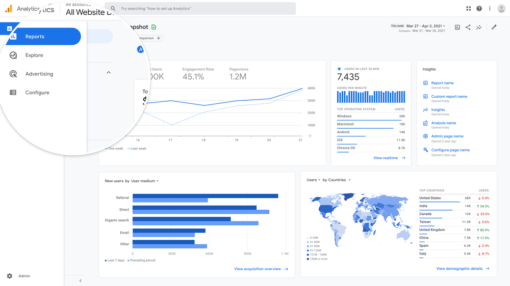
Google Analytics Dashboard
1. No Clear Call-to-Action (CTA)
Let’s start with the biggest culprit: lack of direction. You can’t expect users to take desired actions if you don’t tell them what to do.
A clear call-to-action placement is one of the easiest ways to improve your conversion rate, yet most NZ websites either hide them, phrase them poorly, or forget them altogether. Your CTA should act like a salesperson, guiding the user toward the next step.
Signs your CTAs Suck:
Your button are extremely vague – users have no idea what happens next. I think the worst I’ve seen is “Go to next item.”
CTAs only exist on your contact page, not repeated throughout all of your web pages.
Users scroll, click, and leave without engaging with anything. This could also be a targeting issue!
You have multiple CTAs competing for attention on one screen. In this case, less is more.
The Fix:
Use descriptive, action-based buttons like “Book a Free Quote” or “Get A Consultation Now”.
Position your CTA “above the fold” on key pages and repeat it as users scroll. Think about the journey you’re taking your audience on and the destination.
Use colour contrast to make your buttons stand out (but not clash with your brand).
Test your CTAs with tools like Hotjar or Google Optimise to see what gets more clicks.
Want to get more leads from your website? Start by telling users what to do next and move them down your sales funnel!
2. Poor Mobile Experience
Mobile is no longer optional – it’s the default. Over 60% of your website visitors are likely browsing on their phones. If your website is clunky, slow, or broken on mobile, you’re leaving money on the table and hurting your online presence.
Mobile responsive design means starting with the smallest screen and ensuring the experience is just as powerful as desktop. That includes readable fonts, easy-to-click buttons, and fast load times.
Common mobile fails:
Text and images are cut off or don’t resize properly on smaller screens. Don’t forget videos too!
Menus are non-existent, hidden or require multiple taps to access.
Buttons are too small for thumbs – leading to frustration.
Load speed is significantly slower on mobile than desktop.
Solutions:
Use a responsive framework like Next.js to ensure fluid design across all screen sizes.
Design “thumb-first”: place clickable items within natural reach zones.
Simplify menus for mobile by using accordions or sticky nav bars.
Test your site using multiple real devices – don’t rely on desktop preview only.
Compress mobile image sizes and strip out unnecessary animations or scripts.
An Mobile Optimised website design vs a non-optimised layout
This is especially critical for paid traffic. If you’re spending money on Google Ads or social media campaigns, you’re literally paying to send people to a broken experience. Uh oh, now they think your brand is bad too!
Signs your site it too slow:
Users abandon your site before it finishes loading – especially on mobile.
Images are massive (MBs instead of KBs).
You’re using a bloated CMS or outdated theme.
GTMetrix, PageSpeed Insights or Lighthouse scores are in the red.
You have ads, sliders, or pop-ups which slow down the experience drasticaly.
Quick wins:
Compress images using tools like TinyPNG or ImageOptim.
Use lightweight, fast-loading frameworks (e.g., Next.js over WordPress builders).
Enable browser caching and use a hosting provider with a Content Delivery Network (CDN) like Cloudflare.
Cut out unnecessary third-party scripts and plugin bloat.
Minify CSS, JavaScript, and HTML files – your dev or agency can do this easily.
4. Outdated or Cheap Design Hurts Trust
You wouldn’t wear a 15-year-old tattered suit to a business pitch. So why let your website look like it’s from 2008? Your website design is the first impression most people will have of your business and brand. If it feels outdated, messy, or DIY, users will assume your business is too.
Modern users expect your website to look the part. If your design feels unprofessional or inconsistent, they’ll bounce before even reading a word.
The Trust killers:
Fonts, colours, and layout scream “early 2000s”.
No clear visual hierarchy – everything blends or is smushed together.
You’re using low-resolution images or have irrelevant stock photos are everywhere.
You haven’t updated your design in 5+ years which is the max lifetime of a website.
Visitors bounce before reading a single paragraph.
The Trust builders:
Use a modern, minimal layout with strong spacing and contrast.
Replace stock photos with real team images or case study visuals.
Highlight social proof (reviews, affiliations, awards) on key pages.
Align your visuals with your industry – if you’re a tech company, don’t look like a handyman.
Work with a web design agency that knows CRO-first principles.
A clean, modern design doesn’t just look good – it earns trust.
5. Confusing Navigation & UX
Imagine walking into a store where you can’t find the counter, the staff ignore you, and the exit signs are hidden. That’s what using many websites feels like and it hurts the customer experience.
A good user experience means visitors can find what they’re looking for quickly and intuitively. Every second they spend confused is a chance for them to bounce, missing out on your product or service.
Navigation fails:
Menus are cluttered or not mobile-friendly.
There’s no logical flow to your site – users click in circles.
Pages load inconsistently or break entirely.
It takes more than 3 clicks to reach key info. This is a big fail!
You get frequent questions about things that “should be on the website”.
What to do:
Create a simple, shallow navigation: Home, Services, About, Contact, Blog.
Use breadcrumb navigation to show users where they are.
Map user flows and optimise them: Where should someone go if they want to book a service?
Add “Back to Top” buttons and anchor links on long pages.
If your website isn’t ranking on Google, you’re invisible. A visually attractive site means nothing if no one can find it. And SEO isn’t just about keywords which many people are lead to believe – it’s about building authority, trust, and visibility.
Yet so many NZ businesses skip this entirely or rely on outdated tactics.
Signs your SEO is missing in action:
Your site doesn’t show up on Google for the products or services your brand sells.
You don’t have meta titles or descriptions set on your web pages.
Your images alt text is missing – or stuffed with random phrases that aren’t relevant.
You have no blog or content that targets search queries, builds authority, or answers clients questions.
You don’t show up on Maps or local listings.
Fix it:
Start with keyword research: What are people actually searching in your niche?
Optimise meta titles, H1s, and image tags for SEO – but keep them readable and don’t stuff in keywords.
Create pages for your services, locations, and FAQs to increase indexing.
Register and optimise your Google Business Profile. A big one people skip.. It’s also a good idea to post to GMB every week at least.
Build internal links across your blog and service pages
A good SEO strategy turns your website into a long-term lead engine!
7. Content That Doesn’t Speak to the Audience
You might think your content is clever. But if it doesn’t speak directly to your customer’s pain points, it’s not helping them – and it’s not helping you.
Too many NZ businesses fill their websites with buzzwords and jargon, rather than focusing on clarity and value. Your content should answer real questions and inspire real action.
So, what’s bad content?
It’s generic and filled with clichés (“we’re passionate”, “we deliver solutions”).
Paragraphs are long and unskimmable.
There’s no clear benefit to the reader or clarity as to why they should read it.
It’s all about your business – not the customer.
Zero calls to action or next steps in the copy.
A better approach:
Rewrite in plain English – speak to the reader, not about yourself.
Be location specific. UK English verses US English for varied readers.
Break content into short, scannable chunks with headings and bullets.
Lead with benefits: “You’ll get a faster, easier-to-manage product” > “We build modern solutions”.
Add CTAs in content: “Download the guide”, “Compare packages”, “Talk to an expert”.
Use FAQs, testimonials, and client questions to shape content strategy.
Ask yourself: “What value will the user get from this?”
8. No Trust Builders or Social Proof
You can do everything else right, but if people don’t trust you – they won’t convert. Most users will check for signs that you’re a credible business before they fill in a form or make contact. This is especially true for NZ consumers, who value authenticity and reputation.
Signs your site lacks credibility:
No testimonials, reviews, or recognisable affiliations are visible.
Case studies or client examples are missing.
The site uses stock photos instead of real people.
No SSL certificate or contact details = shady vibes.
Contact forms ask for too much too soon.
How to fix it:
Add real testimonials (text + headshot) near key conversion points.
Link to or feature case studies – even short ones (before/after or quote format).
Show affiliations: Partner platforms, awards, etc.
Make sure your site is on HTTPS and displays trust signals (e.g. email, phone number).
Ask for the bare minimum on contact forms – name, email, message. You can qualify later.
Without trust, traffic means nothing. Build confidence and credibility, and leads will follow.
Choosing a web agency is a big decision – and for many NZ businesses, it ends in regret. Instead of a smooth, performance-focused website, they’re left with locked-in platforms, poor support, and beautiful sites that simply don’t convert.
When the agency focuses only on design, and not on results, you get surface-level wins and long-term pain.
Signs you’re working with the wrong agency:
You don’t know how to update your own website – you have to wait weeks for changes.
The site “looks okay” but isn’t showing up in Google or converting visitors.
You’re stuck on a clunky CMS with poor support or expensive ongoing fees.
Communication is slow, vague, or overly technical – you’re not sure what you’re paying for.
There’s no performance tracking, reports, or clarity on what success even looks like.
How to fix it:
Work with a team that builds websites around business goals – not just pixels and templates.
Ask for full transparency: What platform are you using? Who owns your site and data? How do you edit pages?
Make sure they include SEO, UX, and CRO thinking – not just visual design.
Ensure they offer ongoing support that’s flexible, fast, and easy to access (not buried behind ticketing systems).
If your current agency can’t explain how your site generates leads, it’s time to start fresh.
A great website partner doesn’t just build for today – they help you scale tomorrow.
Why Most NZ Websites Are Built Wrong From Day One
Most websites in NZ don’t fail because of bad intentions. They fail because of bad foundations.
Here’s why:
They’re built by designers, not strategists
Great visuals don’t equal great performance. Without SEO, UX, and conversion thinking, the site can’t do its job.
They’re DIY projects
Many NZ business owners start on Wix or Squarespace with no roadmap. Those tools are quick – but rarely scalable or optimised for SEO.
They’re built with no tracking or goal structure
No goals set in Google Analytics = no idea if the site works. That’s like launching a store without knowing who walks in or buys.
Agencies focus on what looks good, not what gets leads
Unless your agency speaks CRO and UX, they’re probably making you a pretty brochure – not a lead gen machine.
The Website Lead Flow: From Visitor to Lead
Visitor → Interaction → Trust Signal → Call to Action → Lead
To improve your site’s performance, every stage in this journey needs to function properly. If even one link breaks (no trust signal, poor CTA, etc.), the entire funnel collapses.
Common breakdowns in this flow include:
No reason to stay or interact (generic content, unclear value)
No trust markers (testimonials, affiliations, reviews)
Weak or hidden CTAs
This applies across all NZ industries – from tradies and local service providers to eCommerce shops, consultants, and property firms. Everyone needs leads to grow.
What Actually Makes People Take Action on Your Website?
People don’t convert by accident. Every click, form fill, and booking is the result of psychological triggers working in harmony with your website’s design, copy, and flow.
The problem? Most NZ websites are designed to look good – not convert. That’s the difference between a site that gets compliments and one that gets clients.
Let’s break down the core behavioural drivers that turn visitors into leads – and how to apply them to your site.
1. Clear Visual Hierarchy
You have about 3 seconds to show users where to look.
Your design should guide visitors instinctively toward your call to action – not make them guess. This is done using contrast, size, colour, spacing, and layout structure.
Checklist:
Is your main CTA button the most prominent element on the page?
Are you using size and colour contrast to draw attention to key actions?
Is the path to your CTA intuitive on mobile?
If your most important button blends into the background, don’t be surprised when users ignore it.
2. Trust Signals Near Key CTAs
People act when they feel safe. Placing a testimonial, client logo, or success metric beside a booking form increases perceived credibility at the exact moment of decision.
Example:
“We’ve helped over 300 NZ businesses launch high-performing websites” – placed beside the “Book Your Free Audit” button.
Where to place trust signals:
Just before or beside a CTA section
In the hero banner alongside the offer
Near price tables, form sections, or service breakdowns
3. Urgency or Scarcity
A powerful psychological driver: people hate missing out. If your site doesn’t give users a reason to act now, they’ll click away and “come back later” – which usually means never.
How to add urgency:
Limited slots: “Only 3 website slots available this month”
Time-bound offers: “Free audits end Friday at 5PM”
Real-time proof: “14 others booked this week”
Scarcity works best when it’s real – don’t fake urgency. Just give people a reason to act now, not later.
4. Reciprocity
Give something of value, and users are far more likely to give you something in return – like their name, email, or trust.
Examples of giving before asking:
A downloadable checklist or planning guide
A free quote or consultation
Access to a client-only resource or article
Position it as a win-win:
“Grab our free Planning Toolkit to avoid the top 5 mistakes”
“Start with a no-obligation audit to see how your site is really performing”
You build goodwill and get a qualified lead. That’s a win.
A gated pricing page, offering users their price in exchange for their information.
5. One Goal Per Page
Most websites try to do too much – especially on the homepage. If you’re asking users to “Read More,” “Download the PDF,” “Follow on Instagram,” and “Book Now” all at once, they’ll do none of it. It’s an overload!
What to do instead:
Every page should focus on one conversion goal.
Cut non-essential links and keep the pathway clear.
Support that goal with trust, clarity, and simplicity.
Before:
“Explore Our Services”, “Get a Free Quote”, “Subscribe to Newsletter” – all on the same page.
After:
One clear headline, one CTA, one outcome: “Get a Free Website Audit Today”
How to Fix a Website That’s Failing to Convert
You’ve seen what’s wrong – now here’s how to fix it. Each step below directly impacts your ability to turn visitors into leads.
1. Book a Website Audit
Before you start changing things, get a full picture of what’s working (and what isn’t). A professional website audit in NZ looks at your speed, SEO, content, UX, and codebase. It’s the best starting point for making strategic improvements.
Speed affects bounce rate and engagement. Bounce rate and engagement affects lead generation. If your website lags, your leads vanish.
At the same time, even a fast website won’t convert if your CTA is buried, vague, or unclear.
Speed fixes:
Compress and convert all images to WebP for smaller file sizes.
Remove unused scripts, third-party tools, and plugin clutter.
Use a lightweight framework like Next.js for performance-first delivery.
Look at your hosting provider and what they offer – there may be a better provider out there.
CTA placement tips:
Put your main CTA above the fold – on desktop and mobile.
Repeat it at logical points: after testimonials, midway down services pages, and in footers.
Use high-contrast buttons and benefit-based text: “Book Your Free Strategy Call”, not “Submit”.
3. Add Trust Builders (They Work Instantly)
Trust is the fastest way to boost conversions – and one of the most overlooked. If someone lands on your site and doesn’t see proof that you’re credible, they’ll leave. No matter how good your pitch is.
What to add:
Star ratings and Google reviews near your CTA or offer sections.
Real testimonials – ideally with headshots and specific results.
Case study links, media features, or logos of clients you’ve worked with.
Industry certifications or NZ affiliations to show legitimacy.
It’s surprising how many businesses don’t get reviews from their clients, even though they are so crucial. If you’re lacking in reviews, chase up your clients for them after every job or sale. Not only will they help your website, they’re great feedback to improve your business.
4. Rebuild If Your Website Tech Is Holding You Back
If your site was built on an outdated theme or drag-and-drop builder, it might be quicker (and cheaper) to start fresh than keep patching holes.
Many NZ businesses are stuck on platforms like Wix, Squarespace, or bloated WordPress themes that can’t scale, are hard to edit, and kill performance.
How to know it’s time to rebuild:
Your dev takes weeks to make simple edits.
You can’t change content or structure without breaking things.
Your load speeds are slow even after image compression and plugin cleanup.
What to do instead:
Rebuild using a modern CMS or performance-first framework like Next.js.
Make sure your new site is easy to update, responsive, and SEO-friendly.
Prioritise clean code, fast hosting, and modular content structures.
The Neil Group Tuscany Estate website page shown on desktop and responsive mobile layouts
5. Create Content That Solves Real Problems
Most website content is written for the business owner, not the buyer.
To generate leads, your content should answer real questions, solve actual problems, and guide users toward taking action.
How to do it:
Write content around pain points: “Why your garage door is always breaking”, “How to compare builders quotes in NZ”, etc.
Use helpful blog posts, FAQ sections, and downloadable checklists.
Focus each page on one goal and one audience. No fluff.
Example by industry:
Tradies: “What to do if your hot water cylinder fails”
Professional services: “5 signs your legal website is costing you clients”
Consultants/coaches: “How to qualify leads before the first call”
6. Make Your Website Mobile-First, Not Mobile-Forced
Most traffic in NZ comes from mobile – yet many sites are built for desktop, then squashed to fit smaller screens.
How to fix it:
Redesign with mobile in mind: prioritise thumb-friendly nav and simplified structure.
Use responsive frameworks like Next.js that adapt automatically across screen sizes.
Run your site through Google’s Mobile-Friendly Test – and fix all flagged issues.
Avoid pop-ups, small tap targets, and zoom-required text.
7. Fix Your Site’s Navigation & Flow
A website should feel intuitive – like it’s helping users move forward, not making them dig for answers.
How to fix it:
Reduce your top menu to 4–6 clear items.
Use breadcrumb navigation and consistent headers to guide visitors.
Link services from your homepage, not buried 3 levels deep.
Add “Back to Top” buttons and anchor links for long pages.
Ask: Can someone find the contact form in 2 clicks or less?
Not sure where to start? Often (Because it’s your own site) business owners are blinded to the issues since they’ve learnt how to use their website. Ask someone outside your business to use it and watch them – You’ll pick up on the issues very quickly.
8. Build an SEO Foundation That Actually Works
Even a beautiful site won’t generate leads if no one sees it. Make sure you’re not sleeping on SEO because it is a game changer!
How to fix it:
Identify 5–10 primary keywords based on your services and region.
Optimise meta titles, image alt tags, and H1/H2s for those terms.
Add internal links between blogs, services, and your homepage – Make sure they’re relevant!
Create location-specific content and a Google Business Profile.
Use schema markup and submit a sitemap via Google Search Console.
9. Work With an Agency That Builds for Performance
You don’t just need “a new site” – you need the right partner. An agency should genuinely care about the outcome, not just to get a sale or another notch on their (Portfolio) belt.
How to fix it:
Ask what platforms they build on – avoid any who can’t explain pros/cons clearly.
Ask if they use closed source or open source software – This can avoid headaches if you ever need to switch providers later on.
Review real case studies, not just mockups.
Clarify ownership: You should control your domain, content, and hosting – always.
Choose an agency that values collaboration, data, and business outcomes, not just design.
Picking the right agency can be tough (Trust me, as an agency owner I know..). Quote’s can vary between them big time, some chuck out over-complicated words to mystify simple jobs, others will say all the right things up front and then ditch – It’s sad, but a reality. Make sure you do your home work and listen to your gut feeling. Otherwise…
How Can Builtflat Help?
Whether you need a simple refresh or a full rebuild on your website, we work alongside you to deliver a website that drives real leads – not just traffic. We’ve helped multiple brands and even other agencies across New Zealand fix broken funnels, re-engage lost traffic, and turn browsers into buyers.
We focus on strategy, UX, and proper business results – not fluff. If you want a website that finally works for your business, let’s chat.