UI vs UX: Which One Your Website Actually Needs
Most businesses don’t have a “design problem”. They have a misdiagnosis problem.
Something feels off on the website. Enquiries are soft. People bounce. The team starts saying things like “it needs to look more modern” or “the UX is bad”. Then money gets spent. The site looks better, but the numbers barely move.
That is usually because UI and UX are being treated like job titles, not causes. If you want a real improvement (not a cosmetic one), you need a quick way to tell which issue you actually have.
This article is that shortcut. No designer theory. Just a practical diagnosis you can do in about 10 minutes.
The expensive mistake: fixing the wrong thing
UI and UX failures can look the same from inside a business because both end with the same outcome: people do not convert.
But they fail for different reasons.
UI fails when people cannot quickly read, scan, or trust what they are looking at. UX fails when people cannot progress without friction, uncertainty, or mental effort.
If you fix the wrong one, you get the common “we redesigned it and nothing changed” story. Cleaner pages, same hesitation. Better flow, still no trust. Or you spend on a website rebuild and later discover the real issue was speed, broken mobile behaviour, unclear offer, or low-quality traffic.
The goal is not to pick a side. The goal is to stop guessing.
What is UI Design vs UX Design in one sentence?
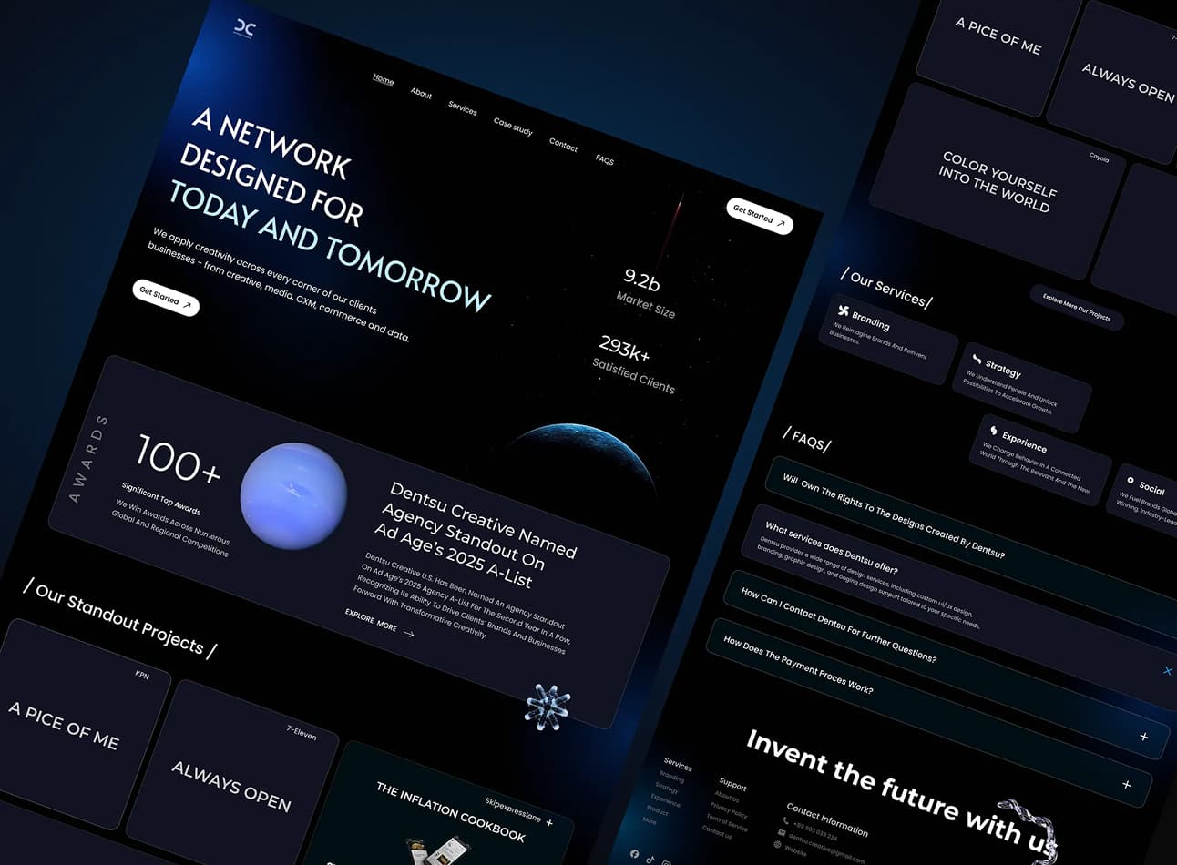
UI (User Interface Design) is the layout, typography, spacing, buttons, and visual hierarchy that make a screen readable and obviously usable, or the layer people see and operate.
UX (User Experience Design) is whether people understand what this page is for, what to do next, and whether the path to action feels effortless or annoying, or the experience of getting a job done.
A simple way to remember it: UI is surface clarity. UX is user momentum.

The “which one do I need?” diagnostic test
Don’t start with opinions. Start with behaviour. Pick one key path that matters, a lead generation point for example (home → service → enquiry is usually enough). Now using heat map and user tracking tools, you can look for the pattern.
If people seem interested but they hesitate, loop around, or abandon halfway, that’s rarely “needs a new look”. That’s usually UX friction. If people do not even engage properly because the page feels messy, hard to read, or untrustworthy, that’s usually UI.
And sometimes it’s neither, which is where teams waste the most money.
Here’s the cheat-sheet version. One block, then we move on.
- If people don’t know what to do next, it’s usually UX (the path and decision structure).
- If people can’t quickly understand what they’re looking at, it’s usually UI (hierarchy, scan-ability, clarity).
- If people start and then abandon partway through, it’s usually UX (effort, uncertainty, steps, form friction).
- If it feels messy, inconsistent, or “cheap”, it’s usually UI (visual system and consistency).
- If it’s slow, buggy, or broken on mobile, it’s a technical issue causing downside in the UX (performance and reliability first).
- If the offer is vague or the traffic is wrong, it’s neither (positioning and acquisition first).
If you’re sitting there thinking “honestly, it’s a mix”, that’s normal. Older sites that have been patched for years usually have both.
That’s also why a short diagnosis phase saves you from paying twice.
Real examples on a typical service website
This is where UI vs UX stops being theory and starts being obvious. I’m going to use three common spots on a service site where things quietly fall apart.
Example 1: The hero section that looks fine but leaks intent
A lot of hero sections look “modern” but still fail. Not because of colour choice or a nicer photo, but because the hero doesn’t answer the two questions a human is asking in the first few seconds:
What is this, and is it for me?What do I do next?
If the hero is vague (“We build digital experiences”) and the buttons are generic (“Learn more”), you’ll often see the same behaviour: people scroll without committing. That’s a UX symptom. They’re not confident enough to choose a direction because the page hasn’t earned the next step yet.
UI can make this worse (weak hierarchy, no contrast, everything the same size), but the core issue is UX: the page isn’t structuring a decision. The first fix is not a redesign. It’s tightening the message, choosing one primary action, and building the first screen around momentum.

Example 2: The service section that explains a lot but convinces nobody
Service pages often contain plenty of information and still feel hard to digest. You’ll see long paragraphs, broad claims, and headings that don’t carry meaning on their own.
If the issue is that people are not absorbing the information, that can be UI. Poor hierarchy means the brain has to work too hard just to understand the structure. But if the issue is that the information is not arranged in a decision order (problem → consequence → proof → next step), that’s UX. The page is forcing people to assemble the argument themselves.
If you want a simple check: if someone can scan the page and still not understand what you actually do and why it matters, you’ve got a UI problem. If they can understand it but still hesitate to act, it’s usually UX.
Example 3: The enquiry form that kills the moment
Forms are a great place to diagnose the difference, because the behaviour is clean.
If people do not start the form at all, the issue is often earlier in the journey. They never got enough confidence to commit. That’s UX.
If people start and abandon, it’s usually one of three things: too much effort, too much uncertainty, or a lack of trust at the moment of action. That’s UX again. UI can contribute (hard-to-read labels, poor spacing, confusing error states), but the reason people leave is almost always that the form asks for too much too soon, or doesn’t reassure them about what happens next.
A strong enquiry step feels like a handrail. Clear, short, and safe.
What to do Monday: a simple decision framework
If you want a practical process that doesn’t require a UX team, do this.
First, pick one path you actually care about. Most businesses have a handful, but start with one. Home → service → enquiry is usually the clearest.
Then do a quick “behaviour pass”. You’re looking for hesitation patterns, not perfection. Open your analytics if you have it, but even without data you can learn a lot by just walking through the journey like a new visitor would.
Now use this structure:
Step 1: Identify the moment people stop movingWhere does momentum break? Is it the first screen, mid-page, or at the final step?
Step 2: Label the cause as UI, UX, or otherUI issues are about readability and clarity on the surface. UX issues are about decision flow and effort. “Other” is performance, offer clarity, trust, or traffic quality.
Step 3: Fix the smallest thing that restores movementDo not start with a redesign brief. Start with one meaningful constraint:
- one primary action per page
- one clear next step per section
- reduce effort in the form
- add reassurance at the moment of commitment
Step 4: Re-check the path and see if behaviour changesYou’re not trying to win awards. You’re trying to remove friction and make action feel obvious.
If that sounds too simple, good. Most websites don’t need more complexity. They need less hesitation.
If you want help diagnosing this properly, this is exactly what our UX/UI work is built for. Start on our UX/UI Service Page, and if you'd rather get an answer from professionals - reach us to us here and we’ll tell you whether it’s UI, UX, or neither.

What most people get wrong about UI vs UX
The most common mistake is thinking you can “add UX” to a website like it’s a plugin. UX is not a layer you bolt on. It’s the discipline of reducing cognitive friction so people can decide and act without having to think too hard.
The second mistake is thinking UI is just aesthetics. UI is the difference between a page that can be scanned and understood in seconds, and a page that forces work. That work becomes hesitation, and hesitation becomes abandonment.
The third mistake is skipping diagnosis and jumping straight to production. You can burn weeks debating visuals when the real issue is that the page never earned trust, never clarified the offer, or never made the next step feel safe.
And finally, the big one: teams blame UX/UI for problems caused by something else. If your leads are irrelevant, your marketing is likely the bottleneck. If the site is slow or buggy, reliability is the bottleneck. If the offer is generic, clarity is the bottleneck. UI/UX can help, but it won’t compensate for the wrong constraint.
What to do next if you’re still unsure
If you read this and you’re thinking, “we have some UI problems and some UX problems and maybe a third thing too”, you’re probably right. That’s common on sites that have been patched and extended over time.
The worst move is to treat that uncertainty as a reason to rebuild everything. The smarter move is to do a short diagnosis, identify the constraint, and fix what restores movement first.
If you want to understand how we approach this as a discipline, start here: UX/UI Design. If you want a direct, business-focused recommendation, book a consult with us and we’ll tell you what’s actually happening, what matters, and what you can ignore.
Also, if your issue is more about first impressions and perceived quality than the journey itself, you may be looking for web design work rather than UX. .
Frequently asked questions: